How do you develop a brand from start to finish?
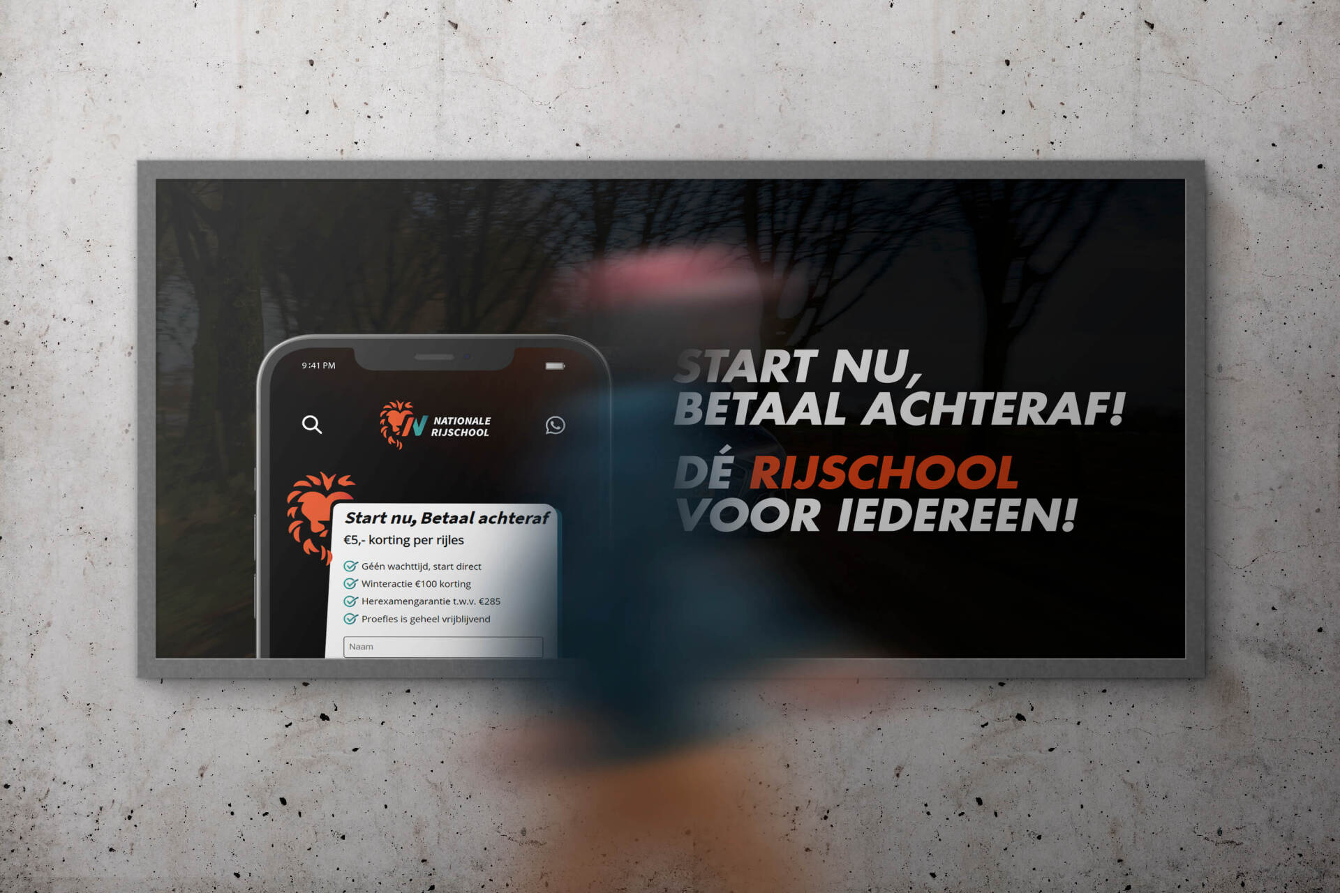
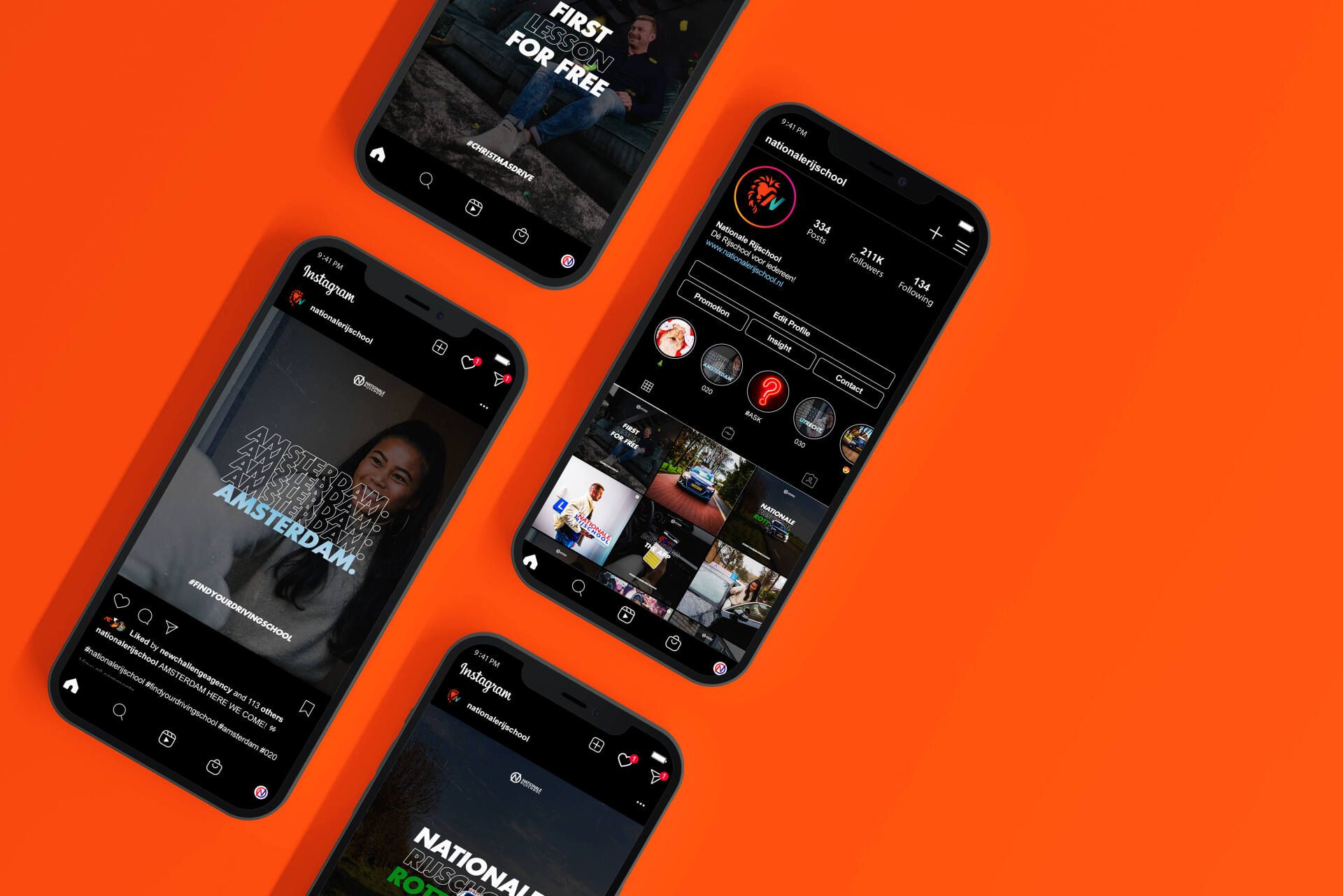
Inspired by and for the Dutch. The lion symbolizes the identity of the National Driving School. A brand-new identity for "The National Driving School." A new 2D/3D logo and a new experience serve as a common thread throughout the website, app, and social media. Give it strength, an identity, and tools to hold on to. Inspire young and old to do the same. Not to stand still, but to look forward.
Services
Branding
Web design
Content strategy
Photos & videos
Customer
The National Driving School
THE NATIONAL DRIVING SCHOOL IS UNDISPUTEDLY ONE OF THE LARGEST DRIVING SCHOOLS IN THE NETHERLANDS.
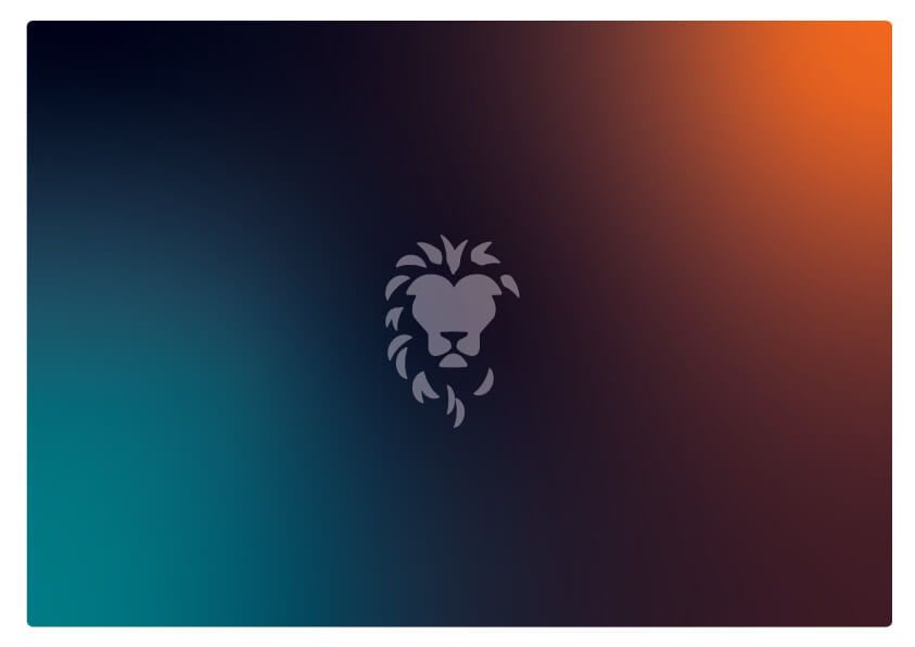
AS A SYMBOL OF STRENGTH, AUTHORITY, COURAGE, POWER, AND (ROYAL) POWER. THE LION IS THE KING AMONG THE MAMMALS.
Instead of launching with new social media content, we started with a new corporate identity for the National Driving School. An identity that will last for years. One for the younger audience, with a reliable one for the older generation.
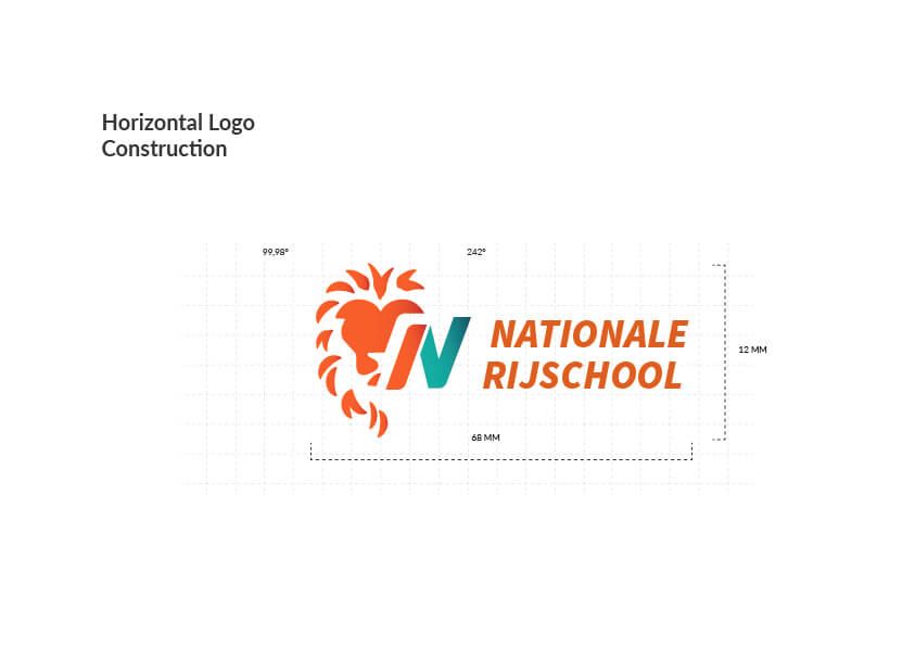
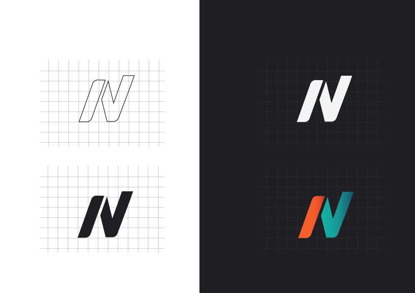
By realigning the lion logo and choosing two different colors, we discovered a visual aspect that combines navigation and expression. This means that even without the logo, you know it's the NR brand.
TEAM NATIONAL DRIVING SCHOOL.
Bring a new voice to the world of driving schools.
Do you challenge us?
Do what you're good at, and we'll do it too!